
| 일 | 월 | 화 | 수 | 목 | 금 | 토 |
|---|---|---|---|---|---|---|
| 1 | ||||||
| 2 | 3 | 4 | 5 | 6 | 7 | 8 |
| 9 | 10 | 11 | 12 | 13 | 14 | 15 |
| 16 | 17 | 18 | 19 | 20 | 21 | 22 |
| 23 | 24 | 25 | 26 | 27 | 28 | 29 |
| 30 |
- 코딩테스트
- Image Segmentation
- Segmentation
- Object Detection
- DilatedNet
- 한빛미디어
- Recsys-KR
- hackerrank
- MySQL
- 엘리스
- 나는 리뷰어다
- 입문
- 파이썬
- TEAM-EDA
- 나는리뷰어다
- Semantic Segmentation
- DFS
- eda
- Python
- 3줄 논문
- 프로그래머스
- 추천시스템
- pytorch
- 알고리즘
- 튜토리얼
- 큐
- 협업필터링
- 스택
- Machine Learning Advanced
- TEAM EDA
- Today
- Total
TEAM EDA
kaggle - Rossmann Store sales Prediction (2) 본문
kaggle - Rossmann Store sales Prediction (2)
김현우 2019. 9. 10. 15:25Note : 이번자료는 집적만든 자료가 아니라 Rossmann Store sales Prediction을 진행하고 있는 다른사람들의 EDA자료를 살펴봄으로써 데이터 탐색을 하는 방법과 다양한 아이디어를 얻어보도록 하겠습니다. 원문저자의 허락을 받아서 번역을 진행하였고 원문의 링크는 아래와 같습니다.
- Python : Time Series Analysis and Forecasts with Prophet by elenapetrova (https://www.kaggle.com/elenapetrova/time-series-analysis-and-forecasts-with-prophet)
- 저자 : elenapetrova (Blog: https://datageekette.com , instagram: @datageekette)
datageekette.com
Workflow Data Science workflow is an ongoing cycle of identifying problems, gathering and wrangling data, designing and building solutions, and communicating the results. This is how I work.
datageekette.com
목적
- 데이터 탐색 (ECDF, 결측치 처리)
- 상점의 타입과 행동양상 분석
- 시계열분석 수행 (계절성, 추세, 자기공산성)
- Prophet을 이용하여 미래의 수요 예측
필요한 패키지
- warnings, numpy , pandas, matplotlib, seaborn, statsmodels, Prophet
### 패키지 로드
import warnings
warnings.filterwarnings("ignore")

# loading packages
# basic + dates
import numpy as np
import pandas as pd
from pandas import datetime

# data visualization
import matplotlib.pyplot as plt
import seaborn as sns # advanced vizs
%matplotlib inline

# statistics
from statsmodels.distributions.empirical_distribution import ECDF

# time series analysis
from statsmodels.tsa.seasonal import seasonal_decompose
from statsmodels.graphics.tsaplots import plot_acf, plot_pacf

# prophet by Facebook
from fbprophet import Prophet
# importing train data to learn
train = pd.read_csv("../input/train.csv",
parse_dates = True, low_memory = False, index_col = 'Date')
# additional store data
store = pd.read_csv("../input/store.csv",
low_memory = False)
# time series as indexes
train.index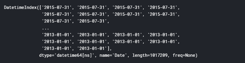
데이터 탐색
첫번째 단계로, 우리는 트레인과 상점데이터의 결측치를 다루고 미래의 분석을 위한 변수들을 생성할 것입니다.
# first glance at the train set: head and tail
print("In total: ", train.shape)
train.head(5)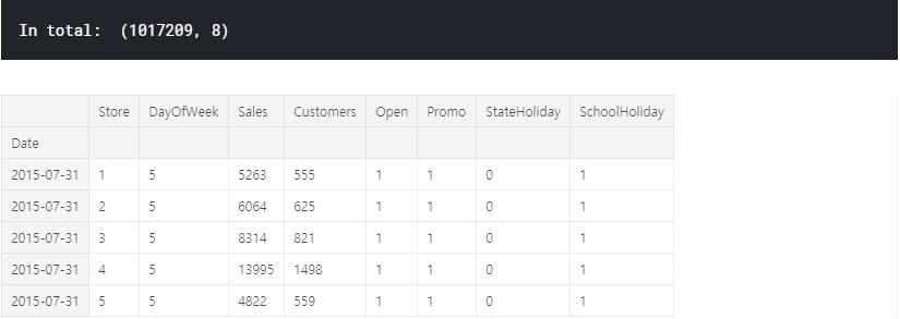
간단한 설명
- Sales : 특정 날짜의 매출 (목적 변수)
- Customers : 특정 날짜의 고객 수
- Open : 상점이 열렸는지 닫혔는지에 대한 표시 0: 닫힘. 1: 열림
- Promo : 특정 날짜에 Promotion이 진행중인지에 대한 표시.
- StateHoliday : 공휴일을 나타냅니다. 일반적으로 공휴일에는 상점이 문을 닫지만 그렇지 않은 곳도 있습니다.
- Schoolholiday : 공립학교의 방학에 의해서 상점이 특정 날짜에 닫혔는지를 암시합니다.
우리는 시계열 데이터를 다루기 때문에 추가 분석을 위해 날짜를 추출하는 데 도움이 될 것입니다. 또한 데이터 세트에 상관 관계가 있는 두 개의 vaiable이 있으며 이를 새로운 기능으로 결합 할 수 있습니다.
# data extraction
train['Year'] = train.index.year
train['Month'] = train.index.month
train['Day'] = train.index.day
train['WeekOfYear'] = train.index.weekofyear

# adding new variable
train['SalePerCustomer'] = train['Sales']/train['Customers']
train['SalePerCustomer'].describe()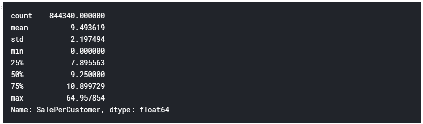
평균적으로 고객은 하루에 약 9.50 $를 소비합니다. 참고로 Sales가 0 인 날이 있습니다. (min = 0)
ECDF: empirical cumulative distribution function
데이터에서 연속 변수에 대한 첫인상을 얻기 위해 ECDF를 플로팅 할 수 있습니다.
sns.set(style = "ticks")# to format into seaborn
c = '#386B7F' # basic color for plots
plt.figure(figsize = (12, 6))

plt.subplot(311)
cdf = ECDF(train['Sales'])
plt.plot(cdf.x, cdf.y, label = "statmodels", color = c);
plt.xlabel('Sales'); plt.ylabel('ECDF');

# plot second ECDF
plt.subplot(312)
cdf = ECDF(train['Customers'])
plt.plot(cdf.x, cdf.y, label = "statmodels", color = c);
plt.xlabel('Customers');

# plot second ECDF
plt.subplot(313)
cdf = ECDF(train['SalePerCustomer'])
plt.plot(cdf.x, cdf.y, label = "statmodels", color = c);
plt.xlabel('Sale per Customer');
데이터의 약 20 %에는 처리해야 할 판매량 / 고객이없고 일일 판매량의 거의 80 %가 1000 미만이었습니다. 따라서 판매량이 0 인 것은 상점이 닫은 것을 의미하는 것인지 확인이 필요합니다.
결측치(Missing values)
닫았거나 매출이 0인 상점들.
# closed stores
train[(train.Open == 0) & (train.Sales == 0)].head()
데이터에 172817 개의 닫힌 상점이 있습니다. 총 관측량의 약 10 %입니다. 편견 예측을 피하기 위해 이러한 값을 삭제합니다.
다음으로 매출이 0 인 열린 상점은 어떻습니까?
# opened stores with zero sales
zero_sales = train[(train.Open != 0) & (train.Sales == 0)]
print("In total: ", zero_sales.shape)
zero_sales.head(5)
흥미롭게도 영업일에 판매가 없는 열린 상점이 있습니다. 데이터에는 54 일 밖에 없으므로 외부 요인 (예 : 증상)이 있다고 가정 할 수 있습니다.
print("Closed stores and days which didn't have any sales won't be counted into the forecasts.")
train = train[(train["Open"] != 0) & (train['Sales'] != 0)]

print("In total: ", train.shape)
상점 정보는 어떻습니까?
# additional information about the stores
store.head()| Store | StoreType | Assortment | CompetitionDistance | CompetitionOpenSinceMonth | CompetitionOpenSinceYear | Promo2 | Promo2SinceWeek | Promo2SinceYear | PromoInterval |
| 1 | c | a | 1270.0 | 9.0 | 2008.0 | 0 | NaN | NaN | NaN |
| 2 | a | a | 570.0 | 11.0 | 2007.0 | 1 | 13.0 | 2010.0 | Jan, Apr, Jul, Oct |
| 3 | a | a | 14130.0 | 12.0 | 2006.0 | 1 | 14.0 | 2011.0 | Jan, Apr, Jul, Oct |
| 4 | c | c | 620.0 | 9.0 | 2009.0 | 0 | NaN | NaN | NaN |
| 5 | a | a | 29910.0 | 4.0 | 2015.0 | 0 | NaN | NaN | NaN |
- Store: 각 상점의 고유 아이디
- StoreType: 4가지 매장 모델: a, b, c, d
- Assortment: assortment 수준을 설명. a = basic, b = extra, c = extended
- CompetitionDistance: 가장 가까운 경쟁 업체 매장까지의 거리
- CompetitionOpenSince[Month/Year]: 가장 가까운 선수가 개설한 대략적인 연도 및 월을 제공합니다.
- Promo2: 프로모션2는 일부 상점에 대한 지속적인 프로모션입니다. 0 : 참여하지 않음. 1 : 참여 함.
- Promo2Since[Year/Week]: 상점이 Promo2에 참여하기 시작한 연도와 달력 주를 설명합니다.
- PromoInterval: 프로모션이 시작된 달의 이름을 지정하여 Promo2가 시작되는 연속 간격을 설명합니다. 예) "2월, 5월, 8월 ,11월"은 각 라운드가 해당 상점의 해당 연도의 2월, 5월, 8월, 11월에 시작함을 의미합니다.
# missing values?
store.isnull().sum()
우리는 처리해야 할 결 측값이 있는 변수가 거의 없습니다. 먼저 CompetitionDistance부터 결측치 처리를 시작하겠습니다.
# missing values in CompetitionDistance
store[pd.isnull(store.CompetitionDistance)]| Store | StoreType | Assortment | CompetitionDistance | CompetitionOpenSinceMonth | CompetitionOpenSinceYear | Promo2 | Promo2SinceWeek | Promo2SinceYear | PromoInterval |
| 291 | d | a | NaN | NaN | NaN | 0 | NaN | NaN | NaN |
| 622 | a | c | NaN | NaN | NaN | 0 | NaN | NaN | NaN |
| 879 | d | a | NaN | NaN | NaN | 1 | 5 | 2013.0 | Feb, May, Aug, Nov |
이 정보는 데이터에서 간단히 누락됩니다. 특별한 패턴이 관찰되지 않았습니다. 이 경우 NaN을 중간 값 (평균의 두 배)으로 바꾸는 것이 합리적입니다. (역자 생각 : Median으로 처리하는게 좋은지 의문이 듬. 사실 Copetition Distance가 NaN인 데이터는 경쟁업체가 없어서 생긴 것일수도 있으니 0값이 있는지 먼저 확인하고 진행했으면 더 좋았을 것 같음.)
# fill NaN with a median value (skewed distribuion)
store['CompetitionDistance'].fillna(store['CompetitionDistance'].median(), inplace = True)
누락 된 데이터로 계속 진행합니다. `Promo2SinceWeek`는 어떻습니까? 비정상적인 데이터 포인트를 관찰 할 수 있습니까?
# no promo = no information about the promo?
_ = store[pd.isnull(store.Promo2SinceWeek)]
_[_.Promo2 != 0].shape
아니요, Promo2가 없으면 이에 대한 정보가 없습니다. 이 값을 0으로 바꿀 수 있습니다. 경쟁, CompetitionOpenSinceMonth 및 CompetitionOpenSinceYear에서 차감되는 변수도 마찬가지입니다. (역자 : 여기에서 아까 짚은 부분에 대한 해결을 진행하네요. )
# replace NA's by 0
store.fillna(0, inplace = True)
print("Joining train set with an additional store information.")
# by specifying inner join we make sure that only those observations
# that are present in both train and store sets are merged together
train_store = pd.merge(train, store, how = 'inner', on = 'Store')
print("In total: ", train_store.shape)
train_store.head()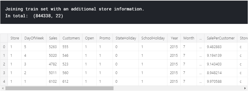
Store types
이 섹션에서는 다양한 레벨의 StoreType과 주요 메트릭 Sales가 어떻게 분배되는지 자세히 살펴볼 것입니다.
train_store.groupby('StoreType')['Sales'].describe()

StoreType B는 다른 모든 제품 중에서 가장 높은 평균 판매량을 기록하지만 데이터는 훨씬 적습니다. 판매 및 고객의 전체 합계를 인쇄하여 가장 많이 판매되고 혼잡 한 StoreType을 확인하십시오.
train_store.groupby('StoreType')['Customers', 'Sales'].sum()

A 형의 상점이 분명합니다. StoreType D는 영업 및 고객 모두에서 2 위를 차지합니다. 날짜는 어떻습니까? Seaborn의 패싯 그리드는이 작업에 가장 적합한 도구입니다.
# sales trends
sns.factorplot(data = train_store, x = 'Month', y = "Sales",
               col = 'StoreType', # per store type in cols
               palette = 'plasma',
               hue = 'StoreType',
               row = 'Promo', # per promo in the store in rows
color = c) 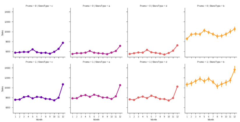
# sales trends
sns.factorplot(data = train_store, x = 'Month', y = "Customers",
               col = 'StoreType', # per store type in cols
               palette = 'plasma',
               hue = 'StoreType',
               row = 'Promo', # per promo in the store in rows
color = c) 
모든 상점 유형은 동일한 경향을 따르지만 (첫 번째) 프로모션 프로모션 및 StoreType 자체 (B의 경우)의 존재 여부에 따라 다른 스케일입니다. 이미 이 시점에서 판매가 크리스마스 휴일로 확대되는 것을 볼 수 있습니다. 그러나 시계열 분석 섹션에서 나중에 계절 성과 추세에 대해 이야기하겠습니다.
# sale per customer trends
sns.factorplot(data = train_store, x = 'Month', y = "SalePerCustomer",
               col = 'StoreType', # per store type in cols
               palette = 'plasma',
               hue = 'StoreType',
               row = 'Promo', # per promo in the store in rows
color = c) 
아하! 위의 그림에서 StoreType B가 가장 많이 팔리고 성능이 좋은 것으로 나타 났지만 실제로는 그렇지 않습니다. StoreType D에서 가장 높은 SalePerCustomer 금액은 약 12 € (프로모션 포함) 및 10 € 미포함입니다. StoreType A와 C는 약 9 €입니다. StoreType B의 낮은 SalePerCustomer 금액은 구매자 카트를 설명합니다. 본질적으로 "작은"물건을 사거나 적은 수량으로 쇼핑하는 사람들이 많이 있습니다. 또한이 StoreType 전체에서 해당 기간 동안 판매량과 고객 수가 가장 적은 것으로 나타났습니다.
# customers
sns.factorplot(data = train_store, x = 'Month', y = "Sales",
               col = 'DayOfWeek', # per store type in cols
               palette = 'plasma',
               hue = 'StoreType',
               row = 'StoreType', # per store type in rows
color = c) 
StoreType C의 상점은 모두 일요일에 문을 닫는 반면 다른 상점은 대부분 문을 엽니다. 흥미롭게도 StoreType D의 상점은 일요일에서 10 월에서 12 월까지만 문을 닫습니다. 일요일에 영업하는 상점은 무엇입니까?
# stores which are opened on Sundays
train_store[(train_store.Open == 1) & (train_store.DayOfWeek == 7)]['Store'].unique()
예비 데이터 분석을 완료하기 위해 경쟁 및 홍보가 시작된 기간을 설명하는 변수를 추가 할 수 있습니다.
# competition open time (in months)
train_store['CompetitionOpen'] = 12 * (train_store.Year - train_store.CompetitionOpenSinceYear) + \
        (train_store.Month - train_store.CompetitionOpenSinceMonth)

# Promo open time
train_store['PromoOpen'] = 12 * (train_store.Year - train_store.Promo2SinceYear) + \
        (train_store.WeekOfYear - train_store.Promo2SinceWeek) / 4.0

# replace NA's by 0
train_store.fillna(0, inplace = True)

# average PromoOpen time and CompetitionOpen time per store type
train_store.loc[:, ['StoreType', 'Sales', 'Customers', 'PromoOpen', 'CompetitionOpen']].groupby('StoreType').mean()
가장 많이 팔리고 붐비는 StoreType A는 경쟁 업체에게 가장 많이 노출 된 것으로 보이지 않습니다. 대신 StoreType B이며 프로모션 기간이 가장 길다.
상관 분석
데이터에 새로운 변수를 추가하는 작업을 마쳤으므로 이제 seaborn 히트 맵을 플로팅하여 전체 상관 관계를 확인할 수 있습니다.
# Compute the correlation matrix
# exclude 'Open' variable
corr_all = train_store.drop('Open', axis = 1).corr()

# Generate a mask for the upper triangle
mask = np.zeros_like(corr_all, dtype = np.bool)
mask[np.triu_indices_from(mask)] = True

# Set up the matplotlib figure
f, ax = plt.subplots(figsize = (11, 9))

# Draw the heatmap with the mask and correct aspect ratio
sns.heatmap(corr_all, mask = mask,
            square = True, linewidths = .5, ax = ax, cmap = "BuPu")
plt.show()

앞에서 언급 한 바와 같이, 우리는 상점의 판매량과 고객 사이에 강한 양의 상관 관계가 있습니다. 또한 매장에 판촉 행사 (프로모션 1)가 있다는 사실과 고객 수 사이에 긍정적 인 상관 관계가 있음을 알 수 있습니다.
그러나 점포가 연속 승격 (Promo2 1)을 계속하자마자 고객 수와 판매 수는 동일하거나 심지어 줄어드는 것처럼 보이며, 이는 히트 맵의 창백한 음의 상관 관계로 설명됩니다. 상점에서 판촉의 존재와 요일 사이에 동일한 부정적인 상관 관계가 관찰됩니다.
# sale per customer trends
sns.factorplot(data = train_store, x = 'DayOfWeek', y = "Sales",
               col = 'Promo',
               row = 'Promo2',
               hue = 'Promo2',
palette = 'RdPu') 
여기 몇 가지 것들이 있습니다.
- 프로모션이없는 경우 프로모션과 프로모션 2가 모두 0 인 경우 일요일 (!)에 판매량이 가장 많은 경향이 있습니다. StoreType C는 일요일에는 작동하지 않습니다. 따라서 주로 StoreType A, B 및 D의 데이터입니다.
- 반대로, 프로모션을 실행하는 상점은 월요일에 대부분의 판매를하는 경향이 있습니다. 이 사실은 Rossmann 마케팅 캠페인에 대한 좋은 지표가 될 수 있습니다. 동일한 경향이 동시에 판촉이있는 상점을 따릅니다 (Promo 및 Promo2는 1).
- 프로모션 2만으로는 판매 금액의 큰 변화와 상관이없는 것 같습니다. 이것은 위의 히트 맵의 파란색 창백한 영역으로도 나타납니다.
EDA의 결론
- 가장 많이 팔리고 붐비는 StoreType은 A입니다.
- "고객 당 판매량"이 가장 높은 StoreType D는 더 높은 구매자 카트를 나타냅니다. 이 사실을 이용하기 위해 Rossmann은 더 다양한 제품을 제안 할 수 있습니다.
- StoreType B의 낮은 SalePerCustomer 금액은 사람들이 본질적으로 "작은"물건을 위해 쇼핑 할 가능성이 있음을 나타냅니다. 이 StoreType이 전체 기간 동안 최소 판매량과 고객을 생성했지만 큰 잠재력을 보여줍니다.
- 프로모션이 하나 인 프로모션 (Promo)과 프로모션이 전혀없는 일요일 (Promo 및 Promo1이 모두 0 인 경우)에 고객이 더 많이 구매하는 경향이 있습니다.
- 프로모션 2만으로는 판매 금액의 큰 변화와 상관이없는 것 같습니다.
상점 유형별 시계열 분석
시계열이 정규 회귀 문제와 다른 점은 무엇입니까?
- 시간에 따라 다릅니다. 이 경우 관측치가 독립적이라는 선형 회귀 분석의 기본 가정은 유지되지 않습니다.
- 추세가 증가하거나 감소함에 따라 대부분의 시계열에는 계절성 추세, 즉 특정 시간대에 특정한 변형이 있습니다. 예를 들어,이 데이터 세트에서 볼 수있는 크리스마스 휴일입니다.
개별 상점 대신 상점 유형에 대한 시계열 분석을 작성합니다. 이 접근 방식의 주요 장점은 프레젠테이션의 단순성 및 데이터 집합의 다양한 추세와 계절에 대한 전반적인 설명입니다.
이 섹션에서는 트렌드, sesonalities 및 자기 상관과 같은 시계열 데이터를 분석합니다. 일반적으로 분석이 끝나면 계절별 ARIMA (Autoregression Integrated Moving Average) 모델을 개발할 수 있지만 오늘날 우리의 주요 초점은 아닙니다. 대신, 우리는 데이터를 이해하려고 노력하고 나중에 Prophet 방법론을 사용하여 예측을 도출합니다.
계절성
그룹을 나타 내기 위해 상점 유형에서 4 개의 상점을 가져옵니다.
- Store number 2 for StoreType A
- Store number 85 for StoreType B,
- Store number 1 for StoreType C
- Store number 13 for StoreType D.
리샘플링 방법을 사용하여 데이터를 며칠에서 몇 주로 다운 샘플링하여 현재 추세를보다 명확하게 확인할 수도 있습니다.
# preparation: input should be float type
train['Sales'] = train['Sales'] * 1.0

# store types
sales_a = train[train.Store == 2]['Sales']
sales_b = train[train.Store == 85]['Sales'].sort_index(ascending = True) # solve the reverse order
sales_c = train[train.Store == 1]['Sales']
sales_d = train[train.Store == 13]['Sales']

f, (ax1, ax2, ax3, ax4) = plt.subplots(4, figsize = (12, 13))

# store types
sales_a.resample('W').sum().plot(color = c, ax = ax1)
sales_b.resample('W').sum().plot(color = c, ax = ax2)
sales_c.resample('W').sum().plot(color = c, ax = ax3)
sales_d.resample('W').sum().plot(color = c, ax = ax4)
크리스마스 시즌에는 StoreType A와 C의 소매 판매량이 가장 많은 경향이 있으며, 휴일 이후에는 감소합니다. StoreType D (하단)와 동일한 추세를 보았을 수 있지만 2014 년 7 월부터 2015 년 1 월까지 이러한 상점이 문을 닫았을 때 정보가 없습니다.
연간 추세
다음으로 일련의 추세가 있는지 확인하십시오.
f, (ax1, ax2, ax3, ax4) = plt.subplots(4, figsize = (12, 13))

# monthly
decomposition_a = seasonal_decompose(sales_a, model = 'additive', freq = 365)
decomposition_a.trend.plot(color = c, ax = ax1)

decomposition_b = seasonal_decompose(sales_b, model = 'additive', freq = 365)
decomposition_b.trend.plot(color = c, ax = ax2)

decomposition_c = seasonal_decompose(sales_c, model = 'additive', freq = 365)
decomposition_c.trend.plot(color = c, ax = ax3)

decomposition_d = seasonal_decompose(sales_d, model = 'additive', freq = 365)
decomposition_d.trend.plot(color = c, ax = ax4)
StoreType C (위에서 3 위)는 아니지만 전체 매출은 증가한 것으로 보입니다. StoreType A가 데이터 세트에서 가장 많이 판매되는 상점 유형 인 경우에도 택시는 StoreType C와 동일한 감소 궤적을 따르는 것으로 보입니다.
자기 상관
시계열 분석의 다음 단계는 ACF (Autocorrelation Function) 및 PACF (Partial Autocorrelation Function) 플롯을 검토하는 것입니다.
ACF는 지연된 버전 자체와 시계열의 상관 관계를 측정 한 것입니다. 예를 들어, 지연 시간이 5 일 때 ACF는 순간 't1'… 'tn'의 시리즈를 순간 't1-5'… 'tn-5'의 시리즈 (t1-5 및 tn이 엔드 포인트 임)와 비교합니다.
반면에 PACF는 지연된 버전 자체와 시계열 간의 상관 관계를 측정하지만 중재 비교에 의해 설명 된 변형을 제거한 후입니다. 예 : 지연 5에서는 상관 관계를 검사하지만 지연 1에서 4까지 이미 설명한 효과를 제거합니다.
# figure for subplots
plt.figure(figsize = (12, 8))

# acf and pacf for A
plt.subplot(421); plot_acf(sales_a, lags = 50, ax = plt.gca(), color = c)
plt.subplot(422); plot_pacf(sales_a, lags = 50, ax = plt.gca(), color = c)

# acf and pacf for B
plt.subplot(423); plot_acf(sales_b, lags = 50, ax = plt.gca(), color = c)
plt.subplot(424); plot_pacf(sales_b, lags = 50, ax = plt.gca(), color = c)

# acf and pacf for C
plt.subplot(425); plot_acf(sales_c, lags = 50, ax = plt.gca(), color = c)
plt.subplot(426); plot_pacf(sales_c, lags = 50, ax = plt.gca(), color = c)

# acf and pacf for D
plt.subplot(427); plot_acf(sales_d, lags = 50, ax = plt.gca(), color = c)
plt.subplot(428); plot_pacf(sales_d, lags = 50, ax = plt.gca(), color = c)

plt.show()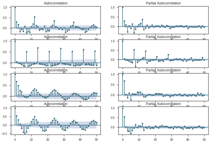
이 그림을 가로로 읽을 수 있습니다. 각 수평 쌍은 A에서 D까지 하나의 'StoreType'에 대한 것입니다. 일반적으로 이러한 도표는 계열과의 상관 관계를 표시합니다 (x 시간 단위로 표시되지 않음).
각 쌍의 플롯에 공통적 인 두 가지가 있습니다 : 시계열의 비 랜더 런스와 높은 지연 -1 (더 높은 차분 d / D가 필요할 것입니다).
- 유형 A 및 유형 B : 두 유형 모두 특정 지연에서 계절성을 나타냅니다. 타입 A의 경우, 12 (s) 및 24 (2) 지연에서 포지티브 스파이크가있는 각 12 번째 관측 값입니다. B 형의 경우 7 (s), 14 (2s), 21 (3s) 및 28 (4s) 시차에서 포지티브 급증으로 주간 추세입니다.
- 유형 C 및 유형 D :이 두 유형의 도표는 더 복잡합니다. 각 관측치가 인접한 관측치와 상관 관계가 있는 것 같습니다.
Time Series Analysis and Forecasting with Prophet
첫 번째 상점에 대한 향후 6 주 예측
Facebook의 Core Data Science 팀은 최근 Prophet이라는 시계열 데이터 예측을위한 새로운 절차를 발표했습니다. 비선형 트렌드가 연도 별 및 주별 계절별 플러스 공휴일에 적합한 가산 모델을 기반으로 합니다. 파이썬 3에서 R로 이미 구현 된 자동화 된 예측(https://www.rdocumentation.org/packages/forecast/versions/7.3/topics/auto.arima)을 수행 할 수 있습니다.
# importing data
df = pd.read_csv("../input/train.csv",
                    low_memory = False)

# remove closed stores and those with no sales
df = df[(df["Open"] != 0) & (df['Sales'] != 0)]

# sales for the store number 1 (StoreType C)
sales = df[df.Store == 1].loc[:, ['Date', 'Sales']]

# reverse to the order: from 2013 to 2015
sales = sales.sort_index(ascending = False)

# to datetime64
sales['Date'] = pd.DatetimeIndex(sales['Date'])
sales.dtypes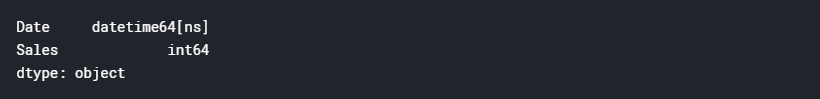
# from the prophet documentation every variables should have specific names
sales = sales.rename(columns = {'Date': 'ds',
                                'Sales': 'y'})
sales.head()
# plot daily sales
ax = sales.set_index('ds').plot(figsize = (12, 4), color = c)
ax.set_ylabel('Daily Number of Sales')
ax.set_xlabel('Date')
plt.show()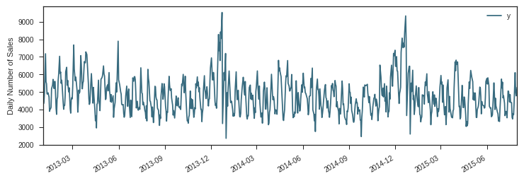
Modeling Holidays
Prophet은 또한 휴일을 위한 모형을 만들 수 있으며(https://facebookincubator.github.io/prophet/docs/holiday_effects.html), 그것이 우리가 Prophet을 하는 이유입니다.
데이터 세트의 StateHoliday 변수는 모든 상점이 정상적으로 닫히는 공휴일을 나타냅니다. 데이터 세트에는 세 라틴 매장도 문을 닫는 방학이 있습니다.
# create holidays dataframe
state_dates = df[(df.StateHoliday == 'a') | (df.StateHoliday == 'b') & (df.StateHoliday == 'c')].loc[:, 'Date'].values
school_dates = df[df.SchoolHoliday == 1].loc[:, 'Date'].values

state = pd.DataFrame({'holiday': 'state_holiday',
                      'ds': pd.to_datetime(state_dates)})
school = pd.DataFrame({'holiday': 'school_holiday',
                      'ds': pd.to_datetime(school_dates)})

holidays = pd.concat((state, school))
holidays.head()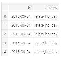
# set the uncertainty interval to 95% (the Prophet default is 80%)
my_model = Prophet(interval_width = 0.95,
                   holidays = holidays)
my_model.fit(sales)

# dataframe that extends into future 6 weeks
future_dates = my_model.make_future_dataframe(periods = 6*7)

print("First week to forecast.")
future_dates.tail(7)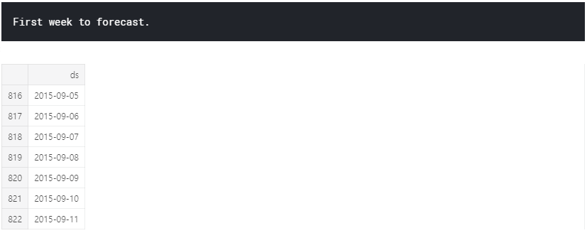
# predictions
forecast = my_model.predict(future_dates)

# preditions for last week
forecast[['ds', 'yhat', 'yhat_lower', 'yhat_upper']].tail(7)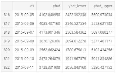
여기서 예측 개체는 예측이 포함 된 열 yhat과 구성 요소 및 불확실성 간격에 대한 열을 포함하는 새로운 데이터 프레임입니다.
fc = forecast[['ds', 'yhat']].rename(columns = {'Date': 'ds', 'Forecast': 'yhat'})
Prophet은 시계열의 관측 값 (검은 점), 예측 된 값 (파란색 선) 및 예측의 불확실성 간격 (파란색 음영 영역)을 표시합니다.
# visualizing predicions
my_model.plot(forecast);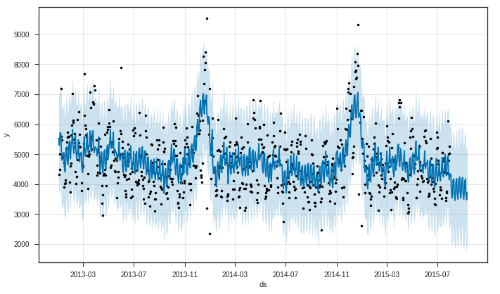
우리가 볼 수 있듯이 Prophet은 추세를 잡으며 대부분의 시간은 미래 가치를 얻습니다. Prophet의 또 다른 강력한 특징 중 하나는 예측 구성 요소를 반환하는 능력입니다. 이를 통해 시계열의 일별, 주별 및 연간 패턴과 수많은 포함 된 휴일이 전체 예측 값에 어떤 영향을 미치는지 알 수 있습니다.
my_model.plot_components(forecast);
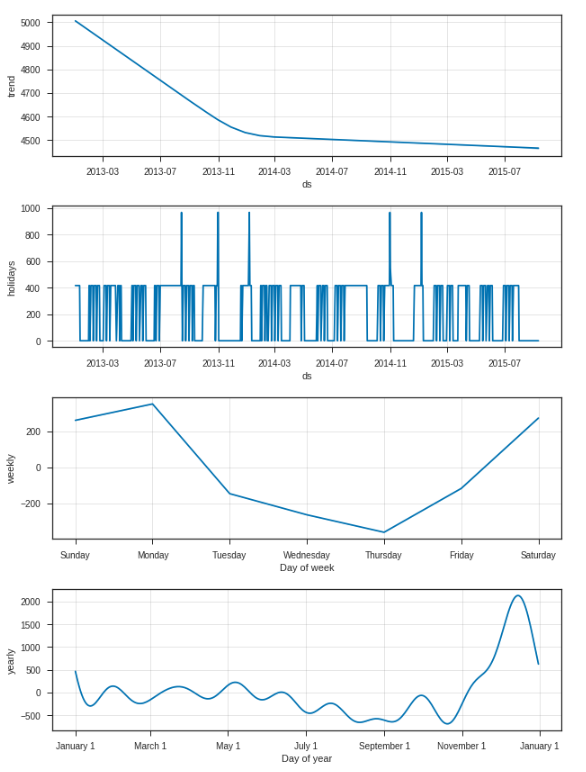
첫 번째 플롯은 매장 번호 1의 월간 매출이 시간이 지남에 따라 선형 적으로 감소하고 있음을 보여주고, 두 번째 플롯은 모델에 포함 된 홀리 아이 간격을 보여줍니다. 세 번째 줄거리는 지난 주 판매량이 매주 다음 주 월요일에 최고치 인 반면, 네 번째 줄거리는 크리스마스 연휴 기간 동안 가장 붐비는 계절이 발생한다는 것을 보여줍니다.
시계열 예측의 결론
이 부분에서 우리는 Facebook Prophet의 새로운 절차를 사용하여 .seasonal_decompose (), ACF 및 PCF 플롯과 적합 예측 모델을 사용하여 시계열 분석에 대해 논의했습니다.
이제 시계열 예측의 주요 장점과 단점을 제시 할 수 있습니다.
장점
- 시간 의존성, 계절성 및 휴일을 설명하는 시계열 예측을 위한 강력한 도구(Prophet: manually).
- 예측 패키지의 R auto.arima ()로 쉽게 구현됩니다.이 패키지는 복잡한 그리드 검색과 복잡한 알고리즘을 실행합니다.
단점
- 외부 기능 간의 상호 작용을 포착하지 않아 모델의 예측 능력을 향상시킬 수 있습니다. 우리의 경우 이러한 변수는 프로모션 및 CompetitionOpen입니다.
- Prophet이 ARIMA를위한 자동화 된 솔루션을 제공하더라도이 방법은 개발 중이며 완전히 안정적이지는 않습니다.
- 계절별 ARIMA 모델에 적합하면 데이터 세트에서 전체 시즌에 4-5 개의 계절이 필요하며 이는 새로운 회사에게 가장 큰 단점이 될 수 있습니다.
- Python의 계절 ARIMA에는 7 개의 하이퍼 매개 변수가 있으며 이는 예측 프로세스의 속도에 큰 영향을 미치는 수동으로 만 조정할 수 있습니다.
다음 자료는 외부데이터를 이용해서 부스팅모델을 만들어보도록 하겠습니다.
'TEAM EDA > EDA 1기 ( 2018.03.01 ~ 2018.09.16 )' 카테고리의 다른 글
| 빅콘테스트 2018 (0) | 2019.09.11 |
|---|---|
| kaggle - Rossmann Store sales Prediction (3) (0) | 2019.09.10 |
| kaggle - Rossmann Store sales Prediction (1) (0) | 2019.09.10 |
| Decision Tree (의사결정나무) (0) | 2019.09.10 |
| linear regression (선형회귀분석) with R (0) | 2019.09.10 |
